Boost Mobile Support Framework
When I was approached about a Boost Support redesign, I collaborated with internal UX designers to learn our centralized visual asset system, studied Sketch, Invision, Adobe XD, and Figma, and worked to create a prototype that would act as the starting point and framework for the overall support structure. Knowing we wouldn’t have the option of search functionality, I worked to create topic categories and flows that narrowed in on specific guides.
Above, I have a basic, interactive prototype to showcase the overall desktop experience. This particular prototype was created in XD. My role was to utilize findings from customer surveys on our other brands’ sites to enhance and simplify the layout and content, and then coordinate with other UX designers and developers to figure out how it would be executed.
Concept UX Design For Dish Mobile Site
As discussions of redesign began for Dish’s website, I took it upon myself to experiment with improving the mobile experience. The idea was to keep things minimal where possible, consolidate dense copy, and use the red color and imagery more effectively throughout the site. We also conducted customer surveys earlier in the year to determine strong points and weak points within existing designs, which then informed this prototype.
This effort was partly designed as a way to learn and create more in Adobe XD as well. I was able to compare the workflow with our Sketch + Invision processes as a result, gain insights into the strengths and weaknesses of each, and learn the ins and outs as I went.
Triglow Website
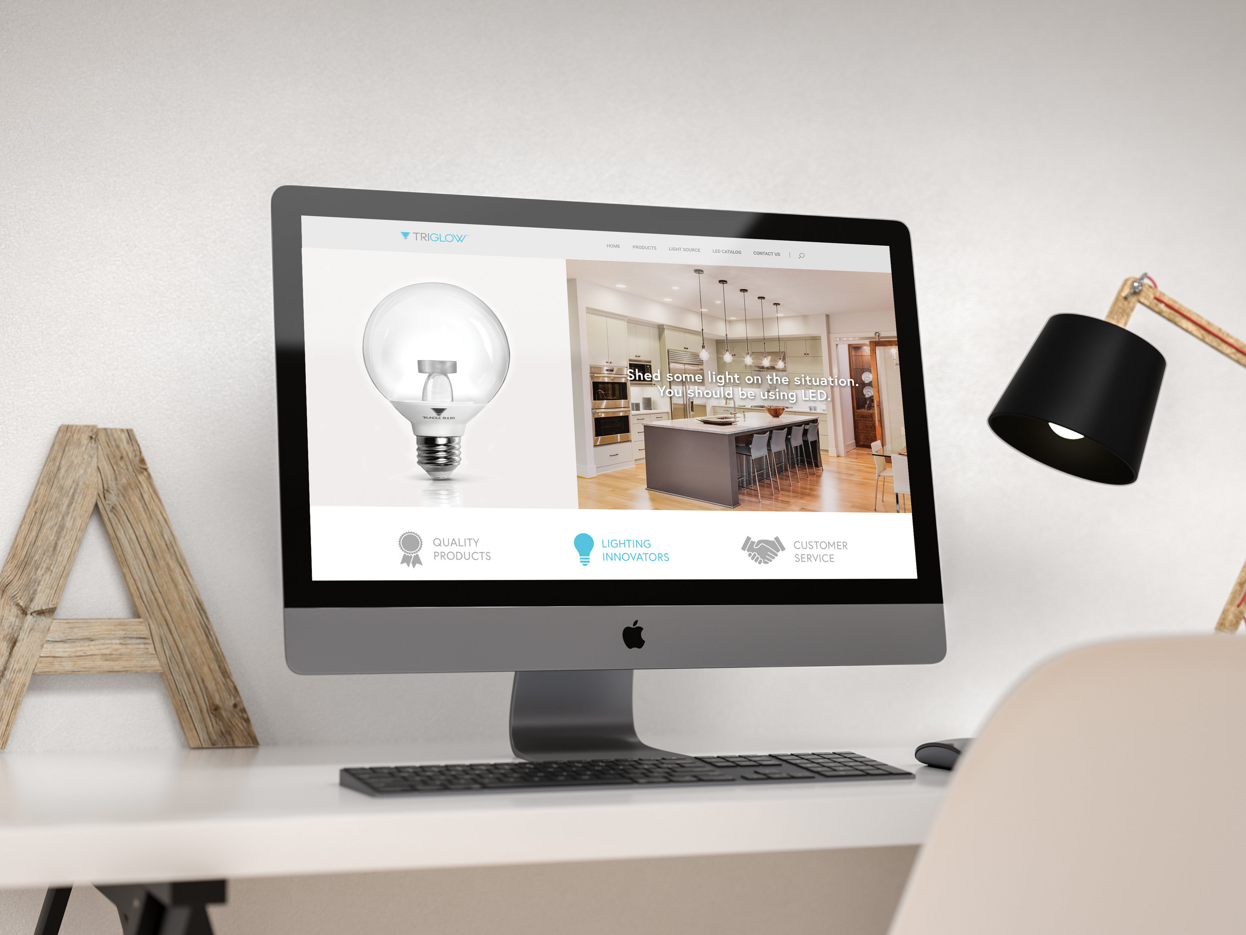
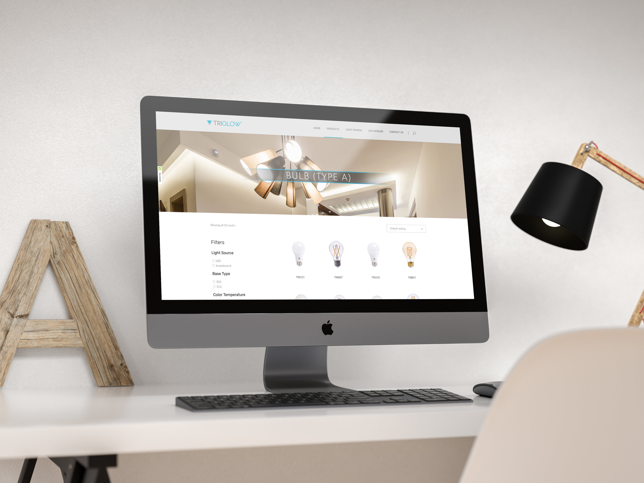
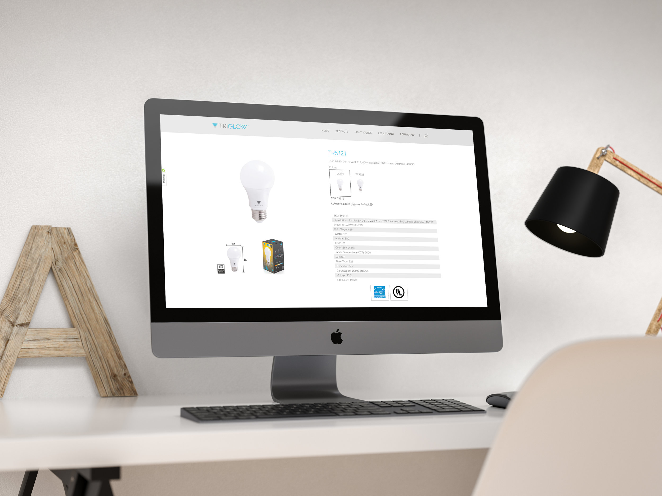
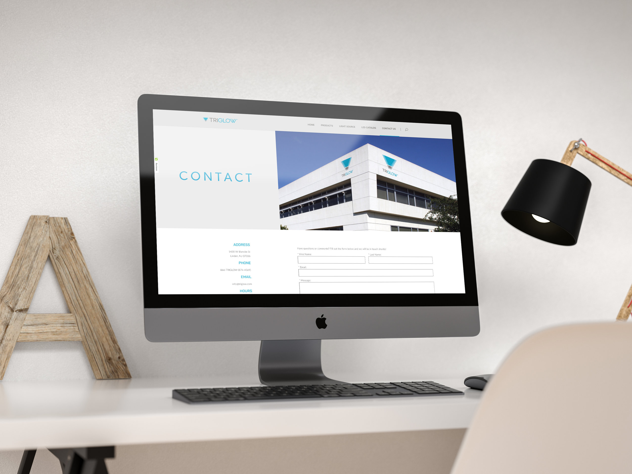
The main objective with the overarching rebrand of Triglow was to simplify a very technical business while also keeping the bulk of detail that businesses and consumers need to understand the products. I was responsible for the over aesthetic and layout for the website and other materials. I incorporated more lifestyle imagery to break up the technical feel, used a lot of light, negative space to let the pages breathe and offer the eye a break, and made things easy to read through and follow on the pages. The mocks here were composed in Photoshop to generate a thematic look and feel before we began coding with a hired 3rd party business.

