SanSoleil Product Banners


I partnered with SanSoleil to create minimalistic, image-focused, banners for different events they attend to sell product. The main objective was to showcase a variety of styles on each banner/side of the double-sided banners, and let the photos do the work. Each photo had to be retouched to sit in the white space cleanly, removing shadows, discoloration, and noise around the edges of each silhouette. The black, sideways logo helped maintain the visual cleanliness and vertical lines of the layout.
Poetry Book Design
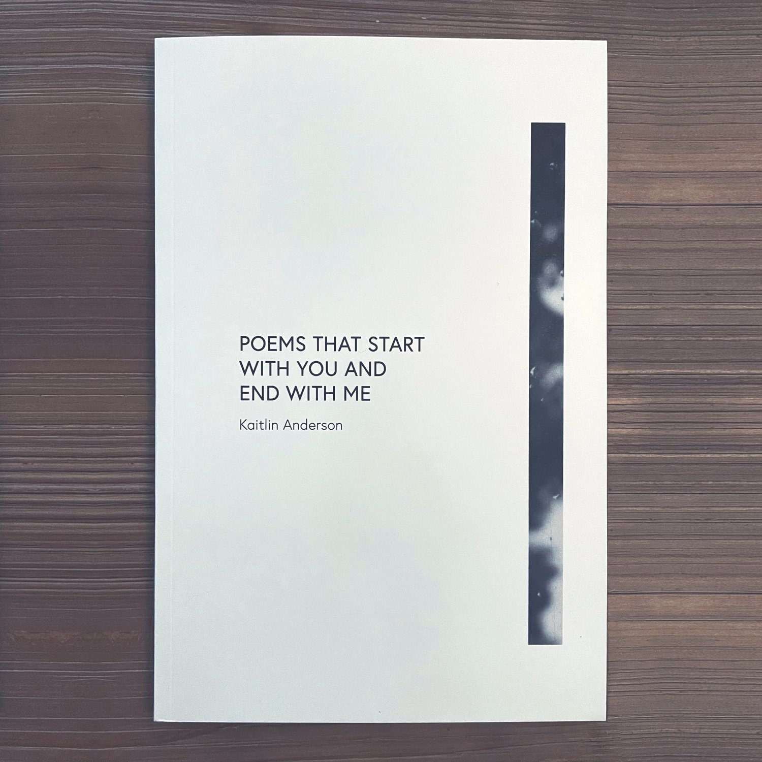
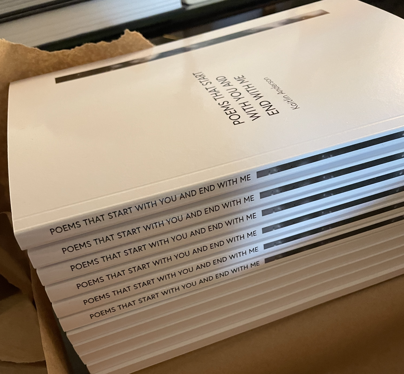
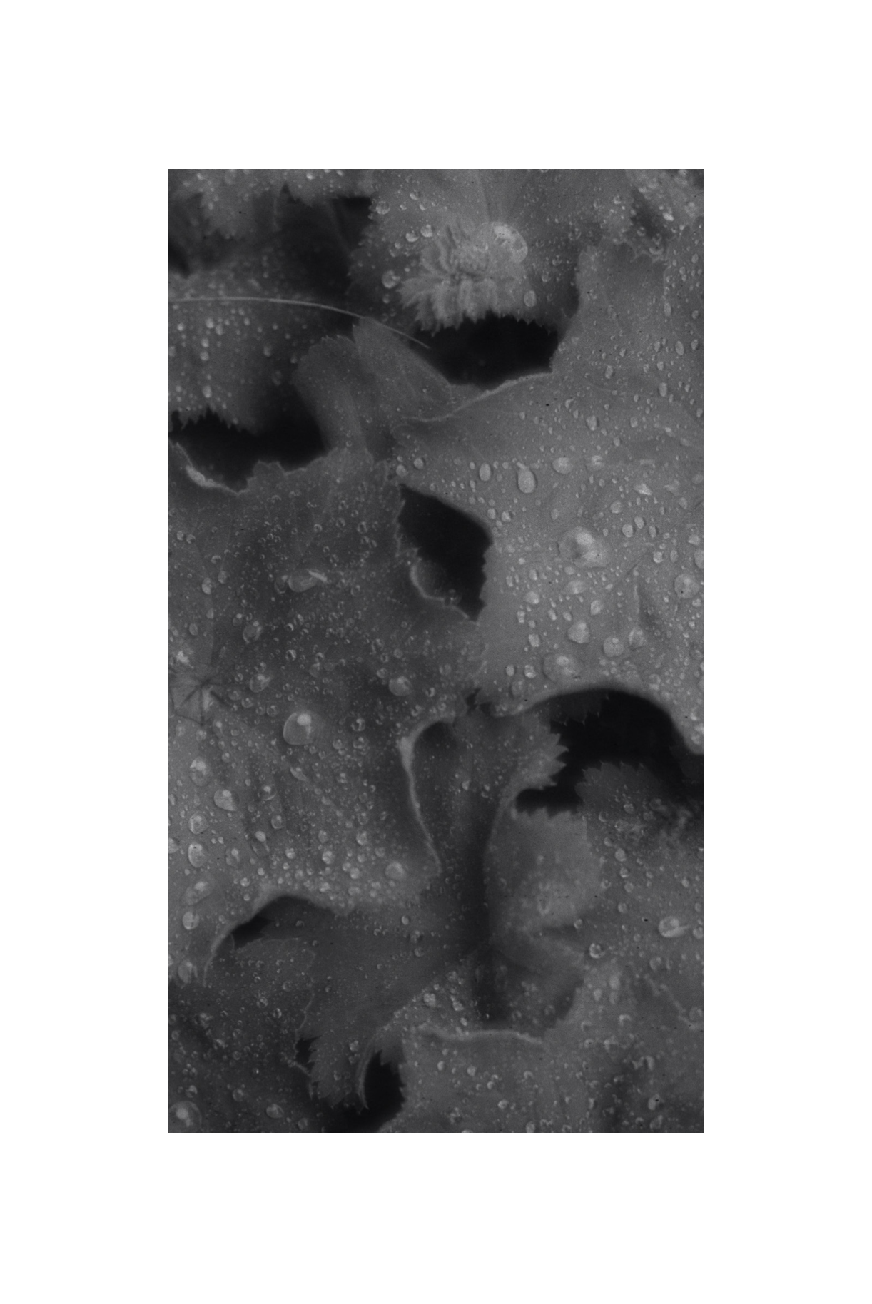
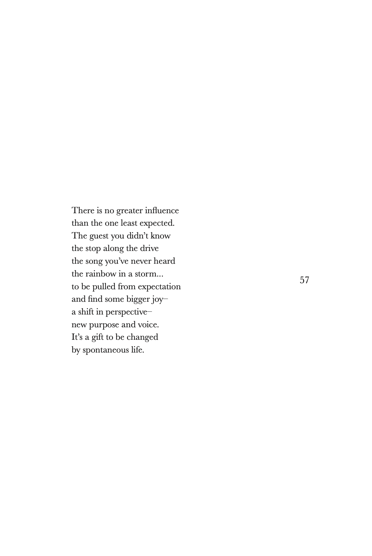
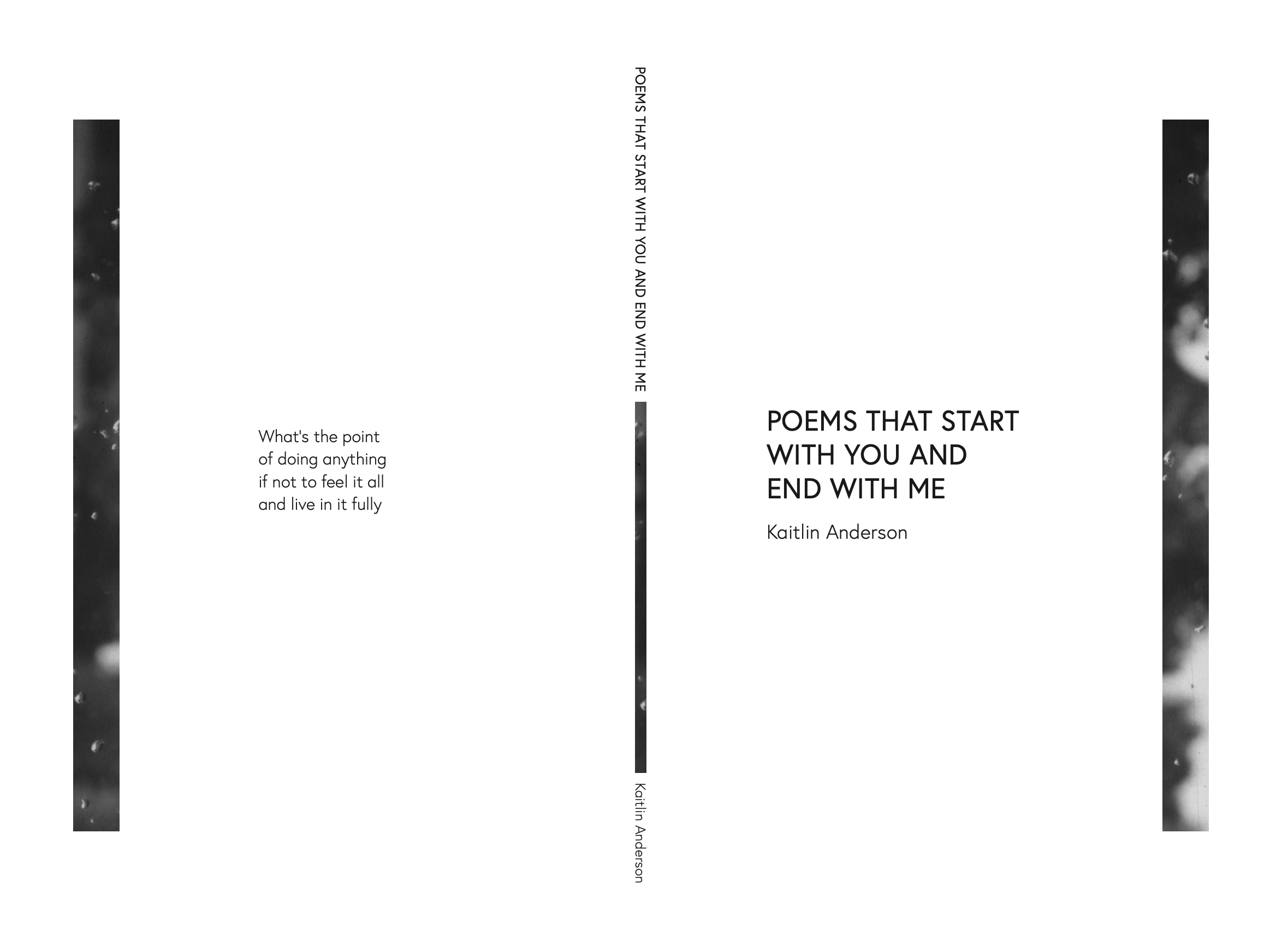
When designing my poetry book, the goal was to make it feel open and like a breath of fresh air. The front and back cover and the spine all have a minimal “window” with rain droplets, looking out at black and white trees. The intention there was to make it seem like you were almost glimpsing into the contents of the book; as if a world lives inside. The inside is predominantly white space and copy, with the page numbers and words centered vertically on the page, creating an overall sense of calm and balance. I placed occasional photographs and abstract pieces of mine on pages to add to the effect of certain poems and the overall character of the book itself.
JoyJolt Packaging Redesign
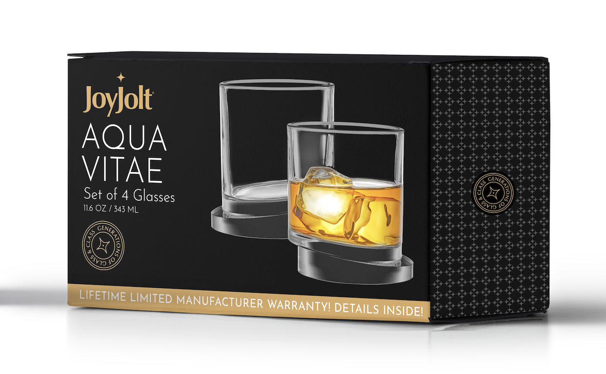
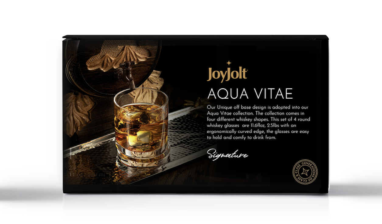
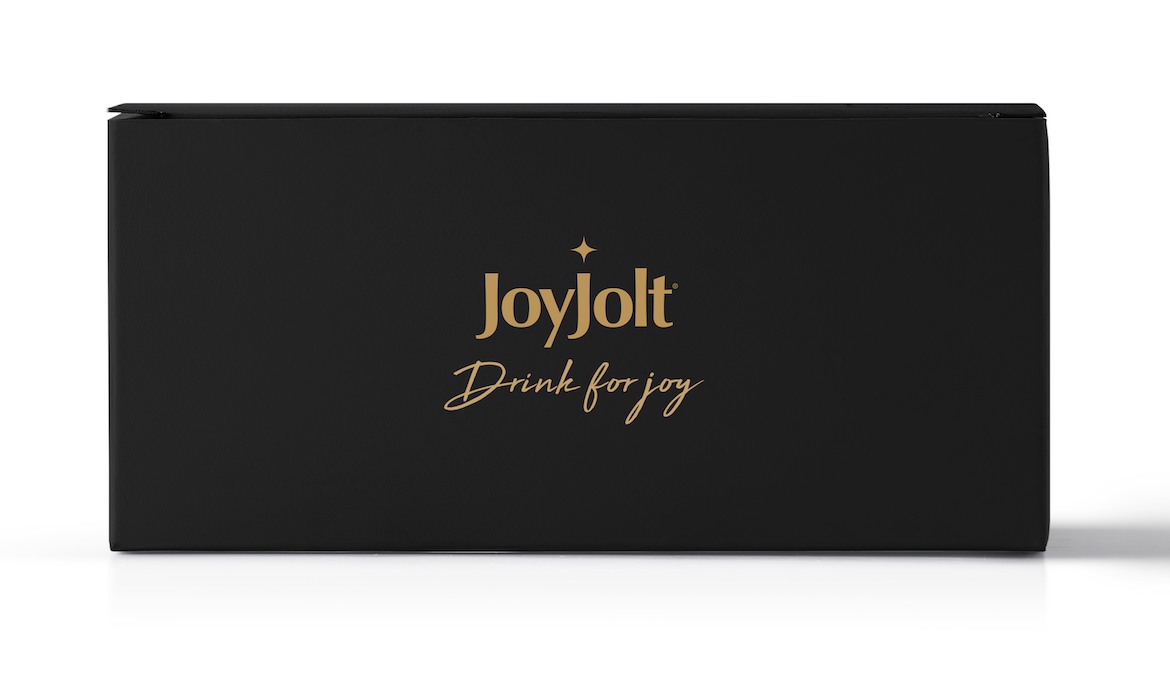
This project’s goal was to create a high-end packaging experience for JoyJolt. Through the use of a black and gold color scheme, we were able to complement the whiskey/brown liquor color in a way that felt classy and modern. On the sides of the box, I created a custom pattern out of the star symbol for some added texture variation. Finally, the gold typography was designed with the intention of being gold foil as well, to add a different dimension on the matte black box and catch the consumer’s eye.
Selections From The Zine
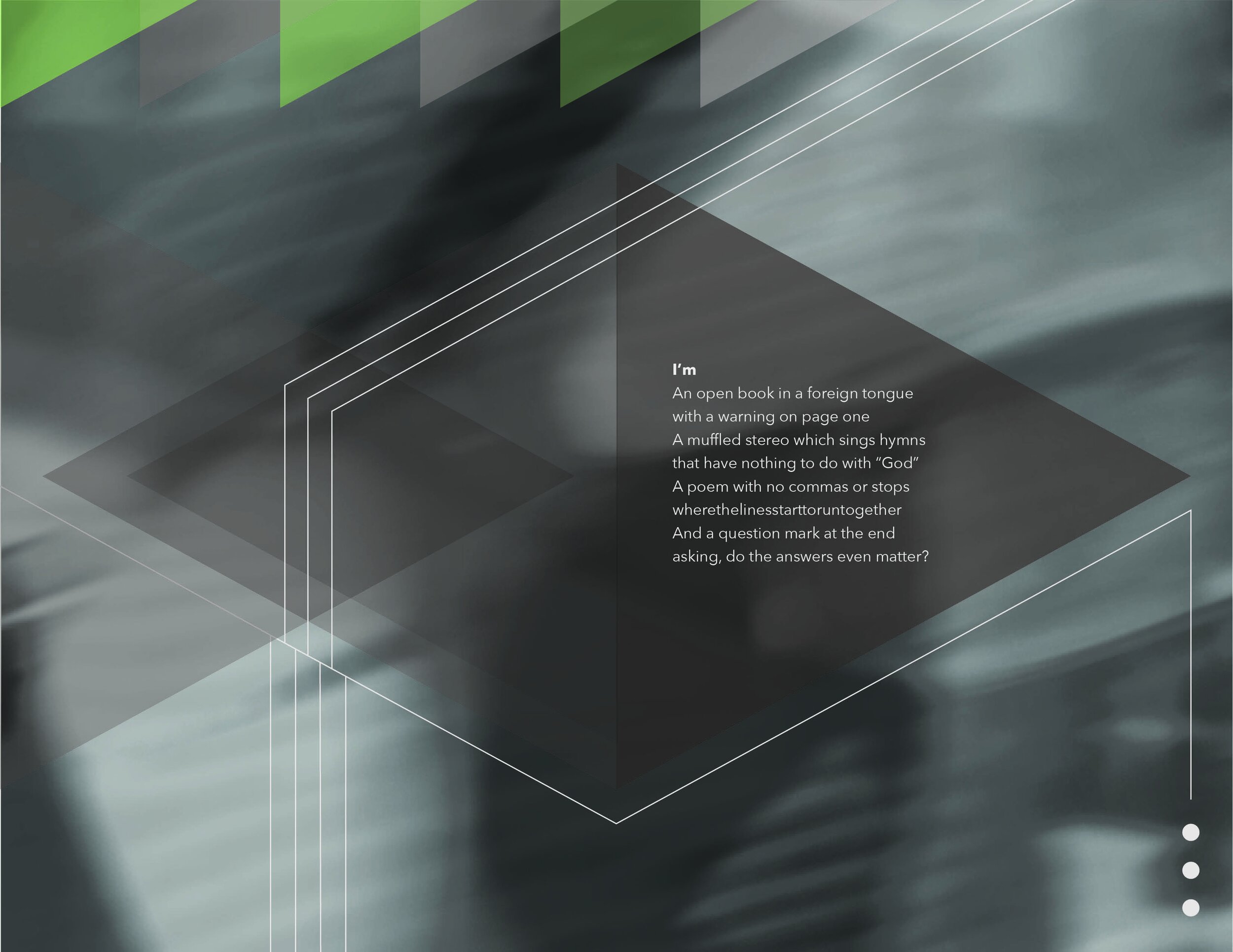

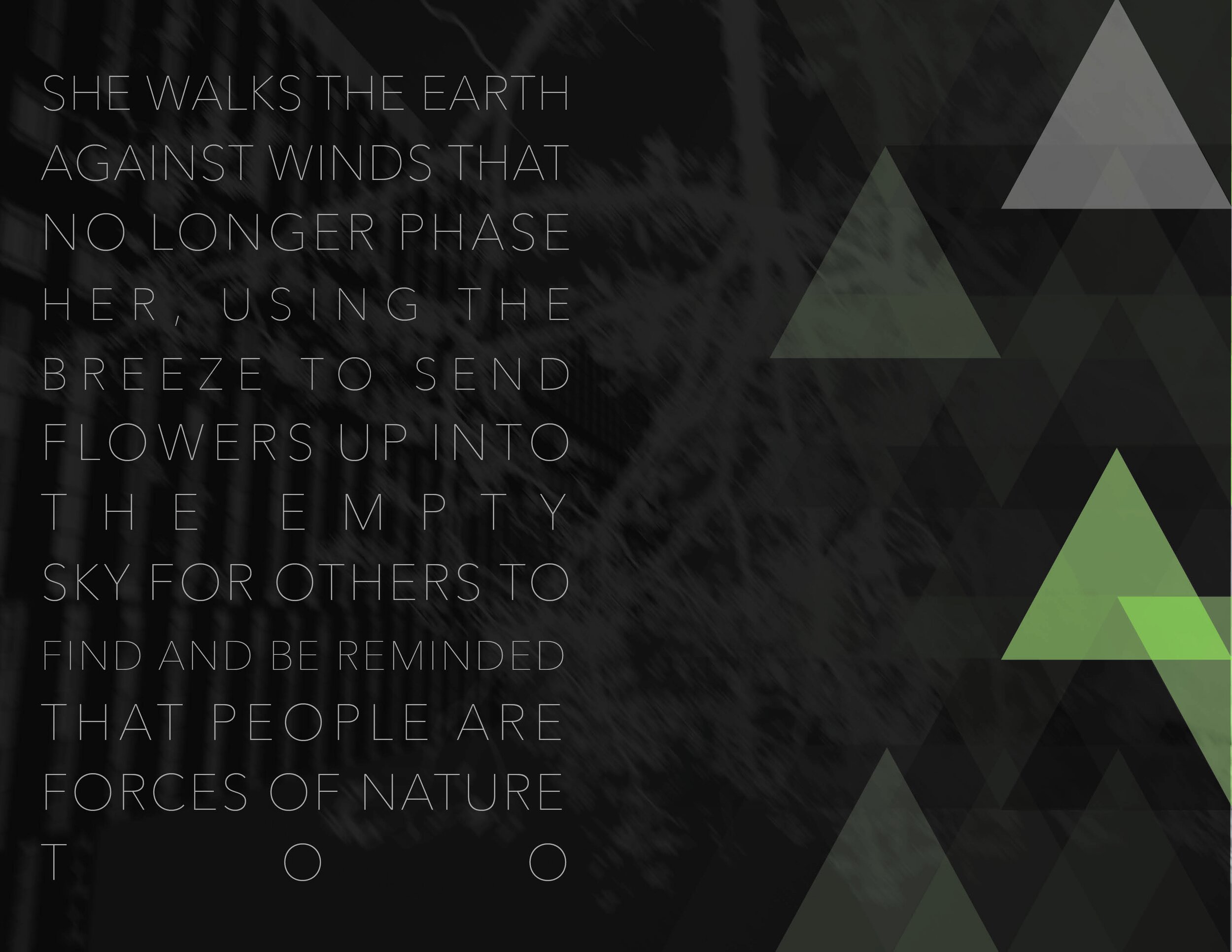

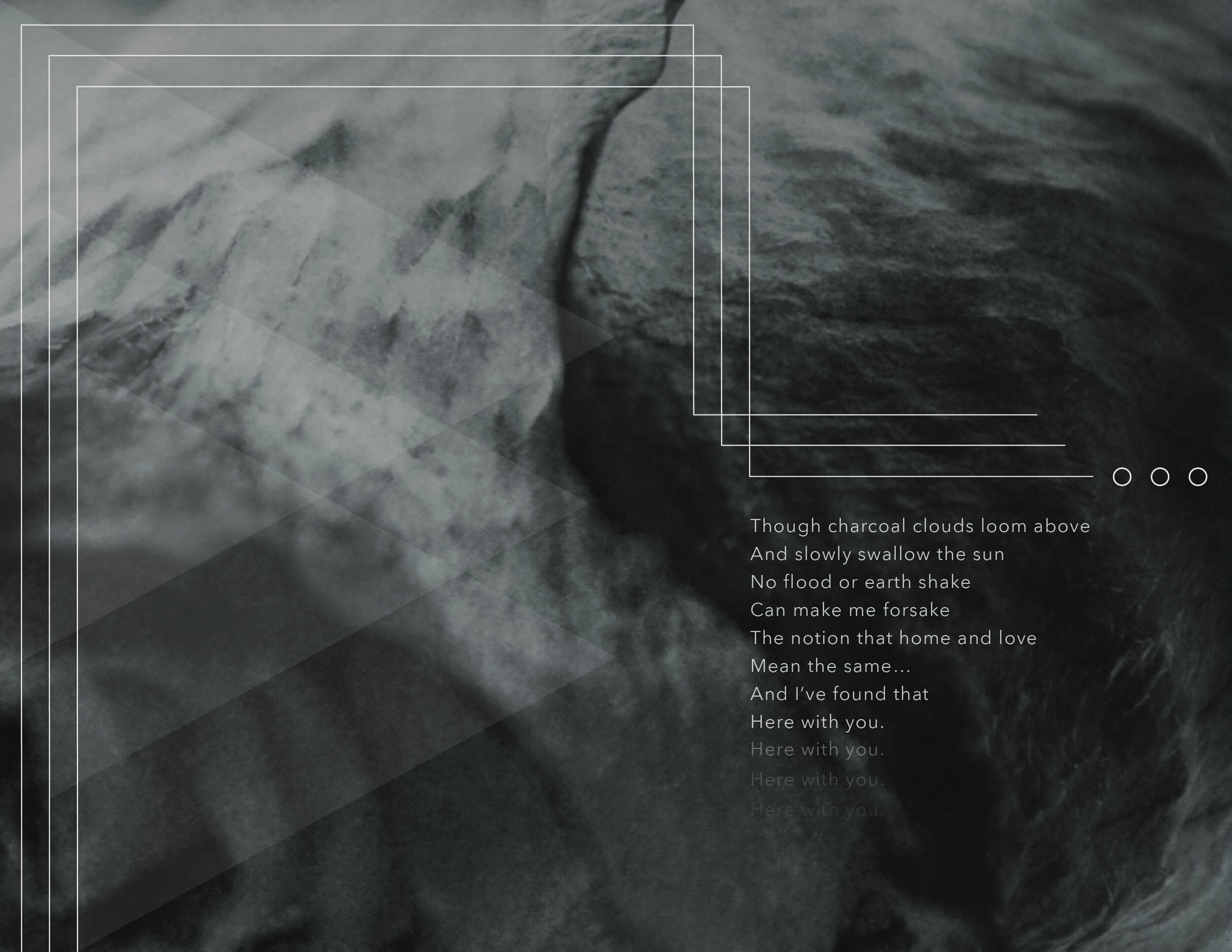
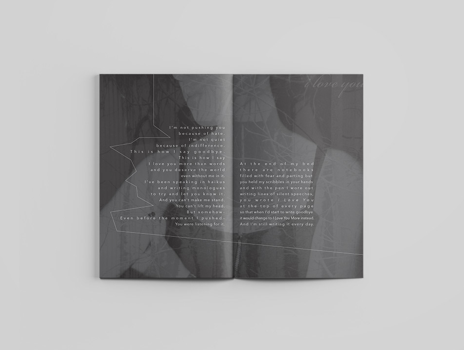
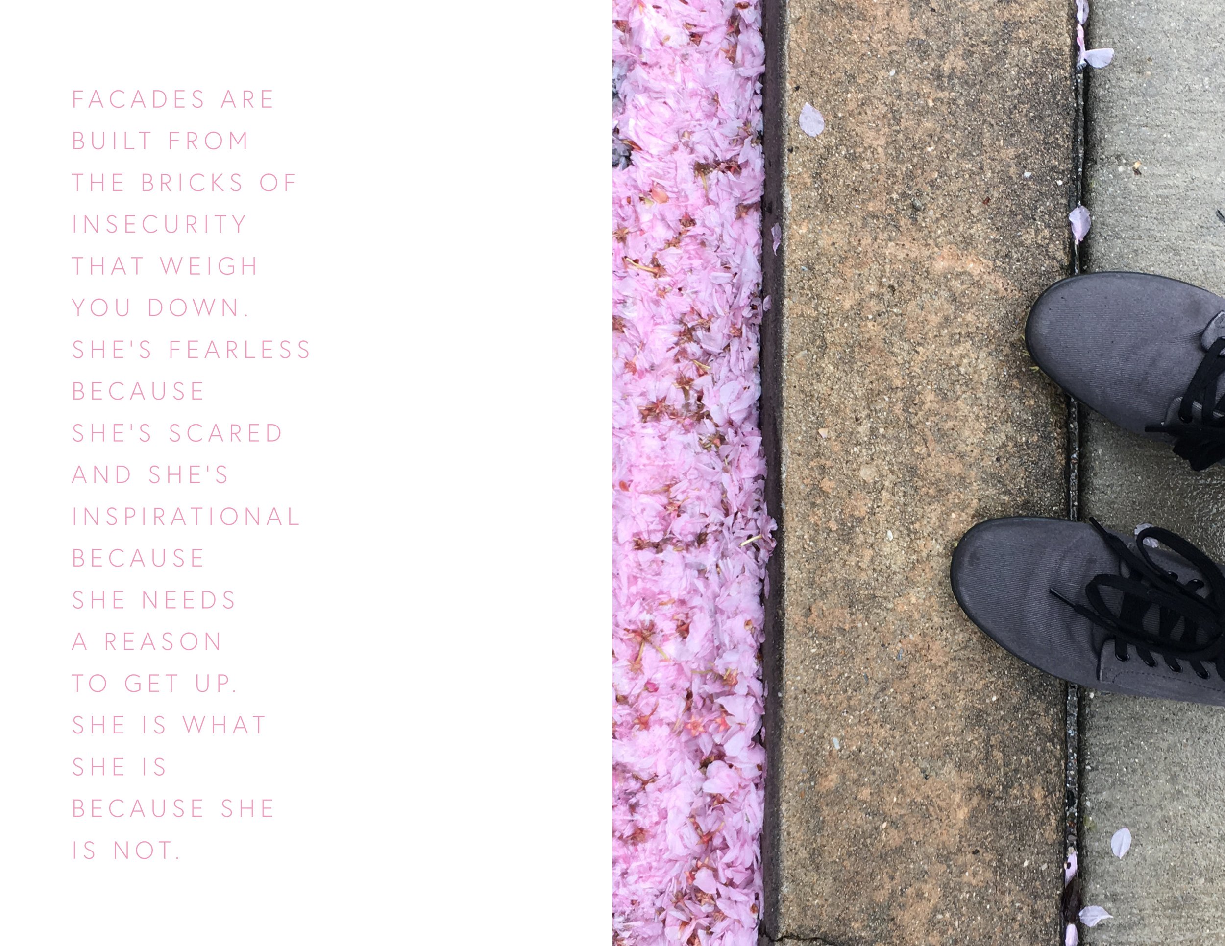
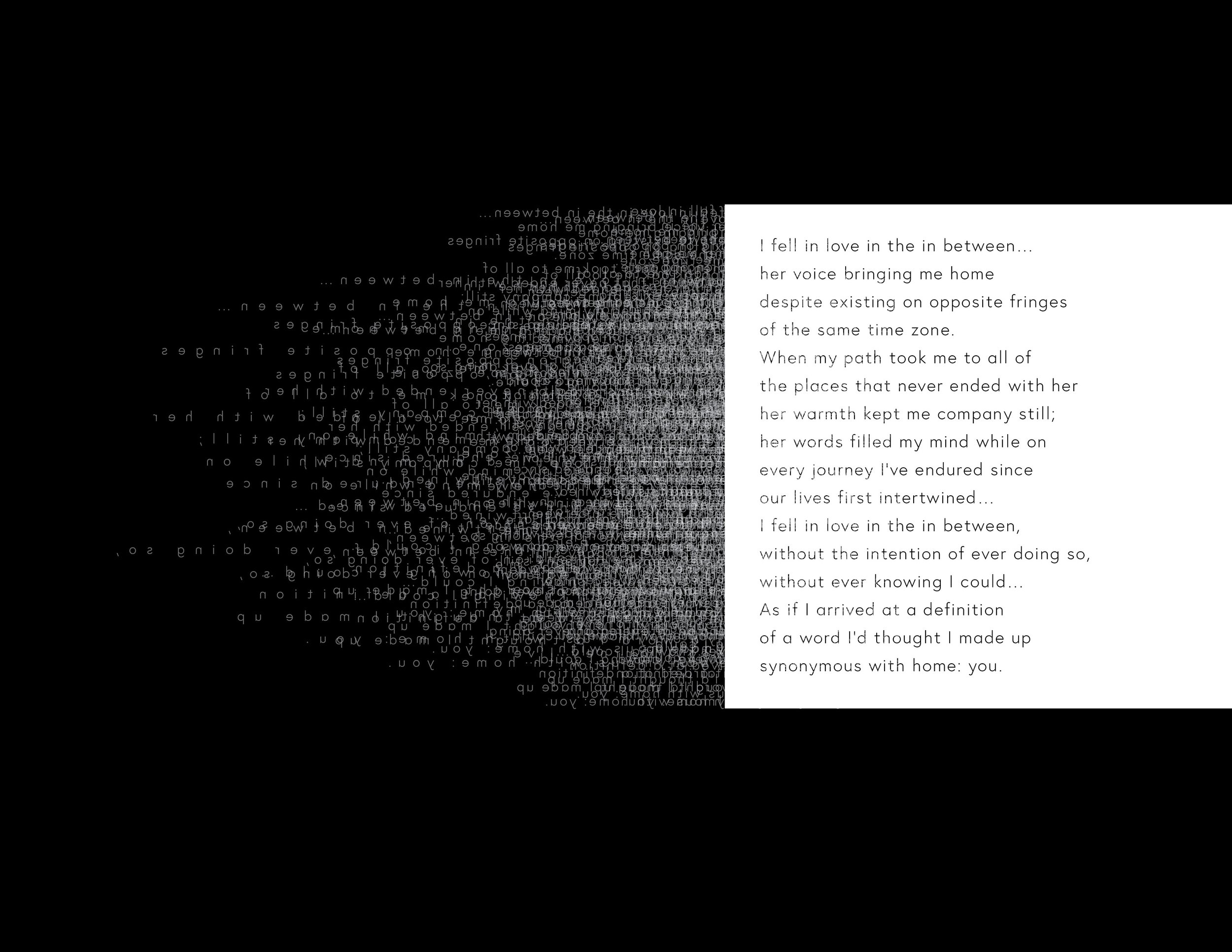
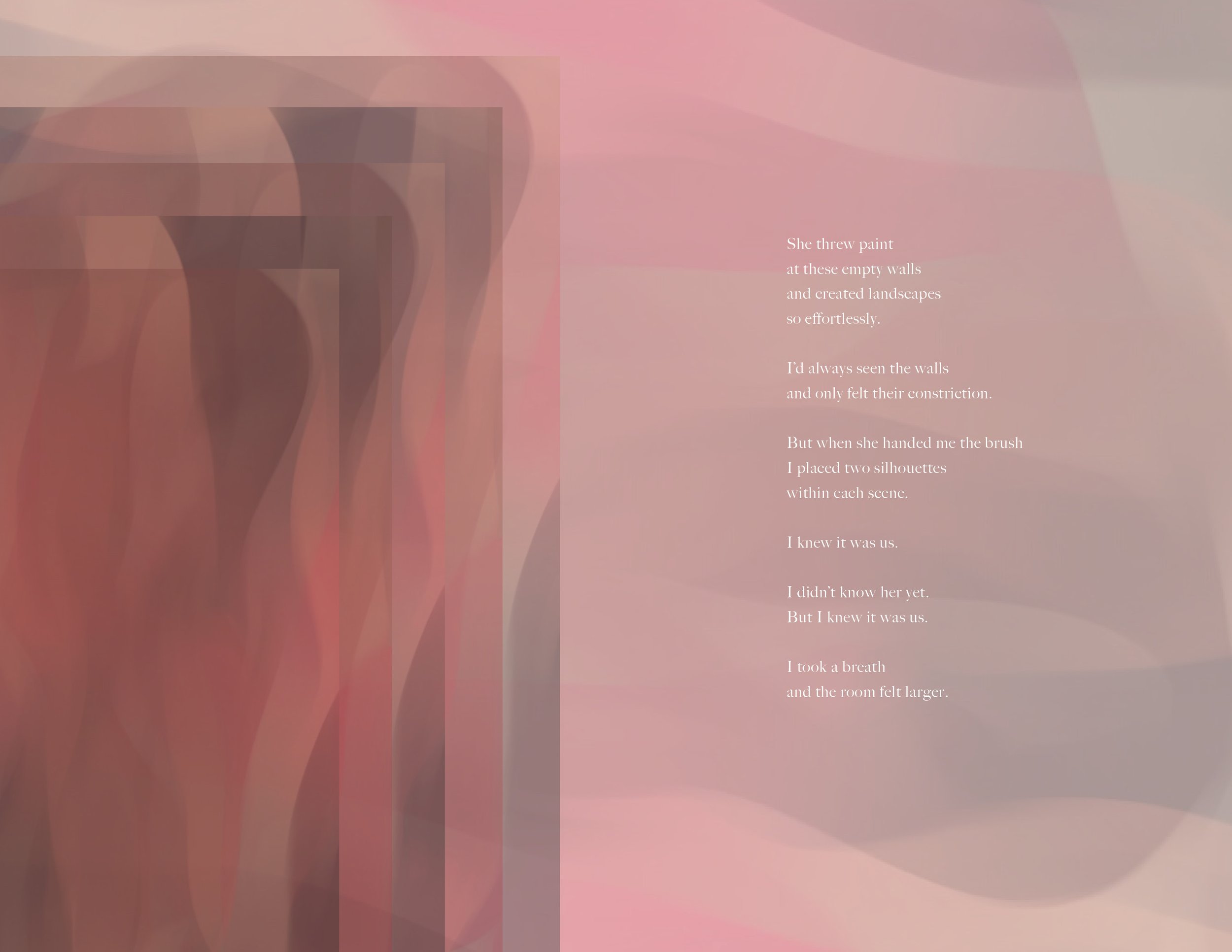
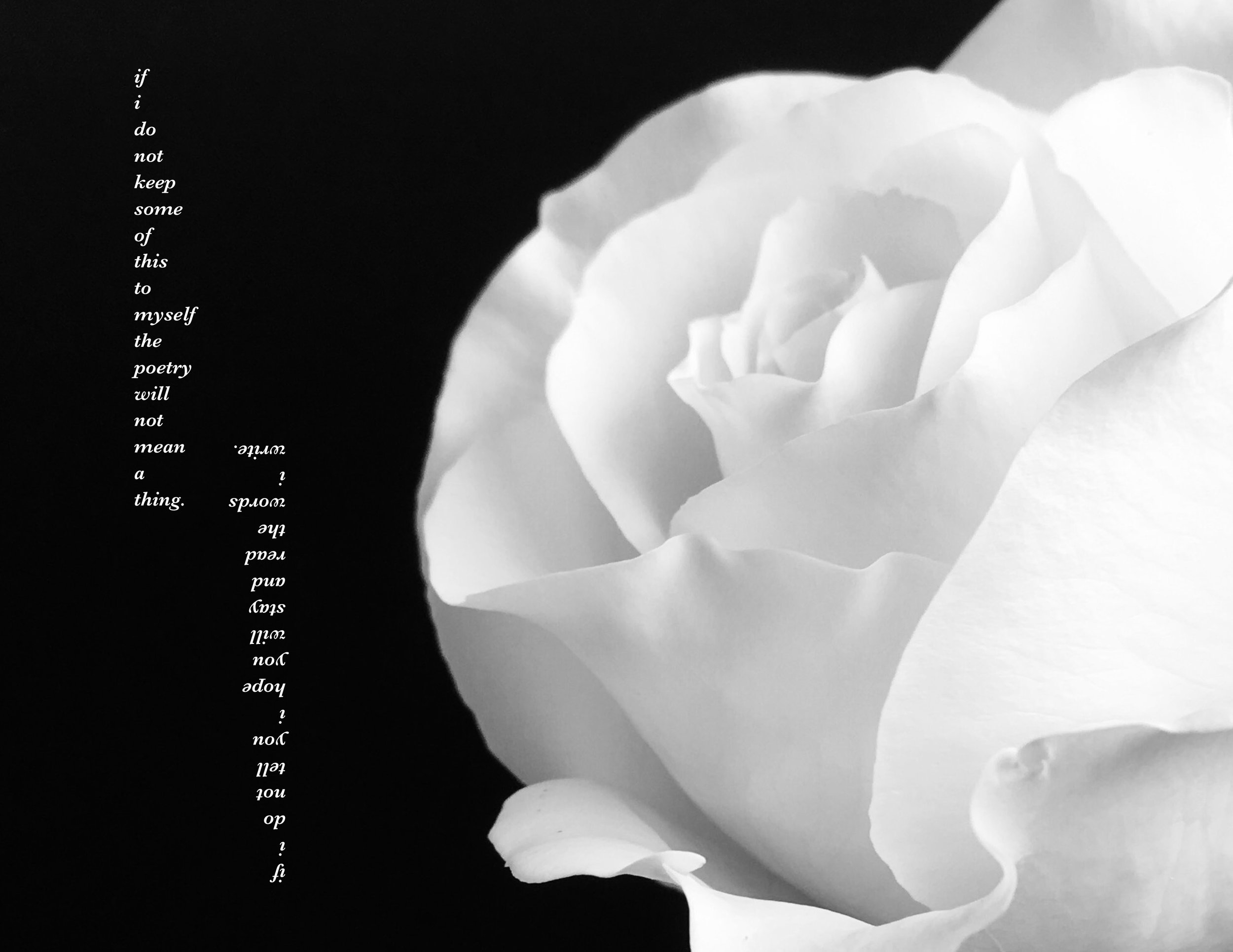
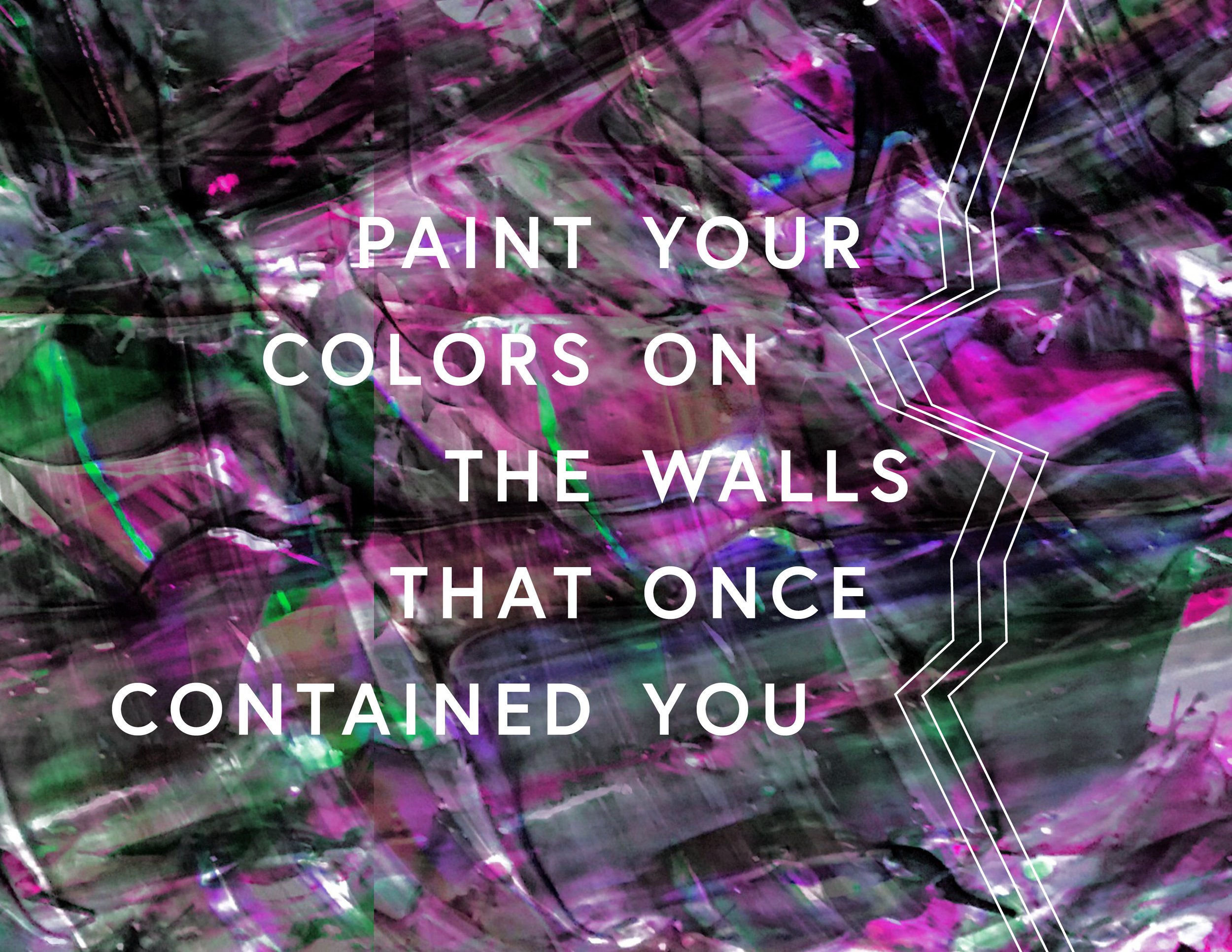
This is a collection of spreads from a zine I started a few years ago called, Dream To See Reality. In the handful of volumes released, there was a variety of original poetry, photography, and design, by myself and some friends as well! It was a playground for typographic experimentation and visual storytelling to pair with the words. It became one of my favorite creative outlets over the years and captured energy in a variety of ways that were very satisfying to explore!
Triglow Catalog Design
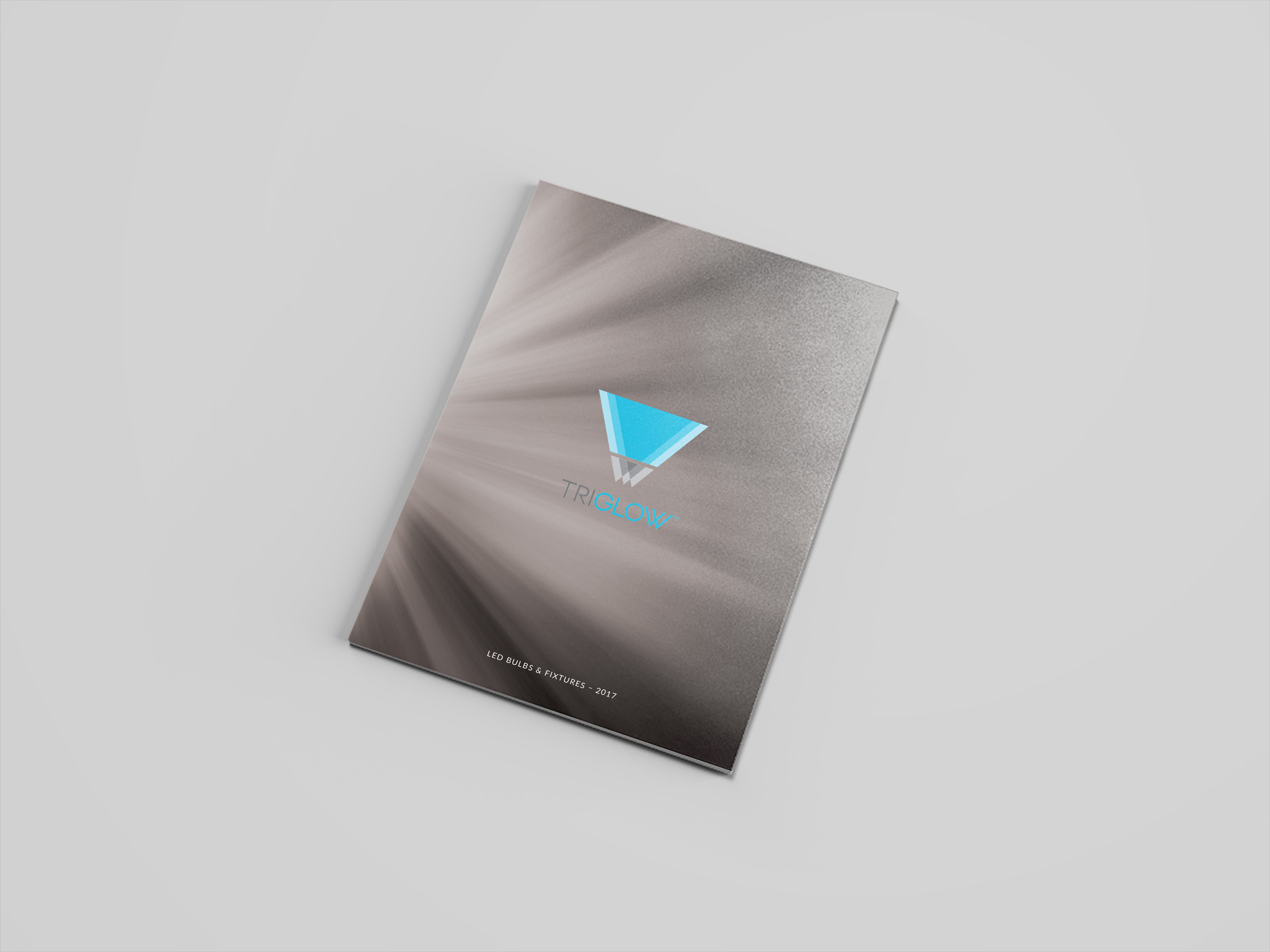
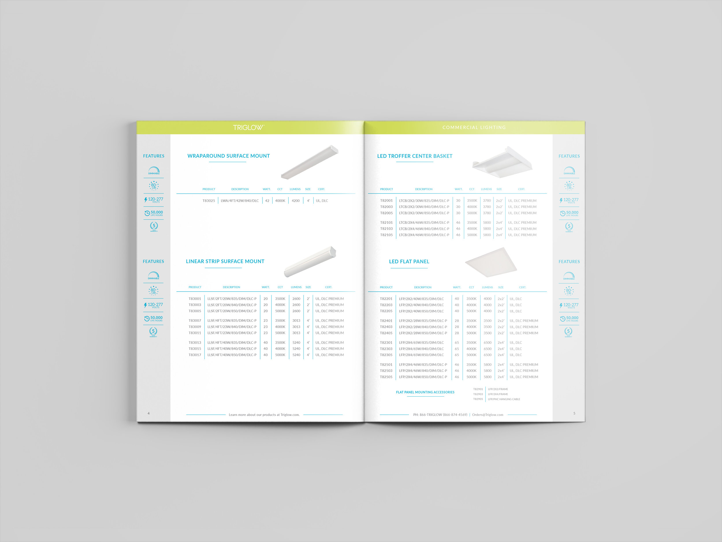
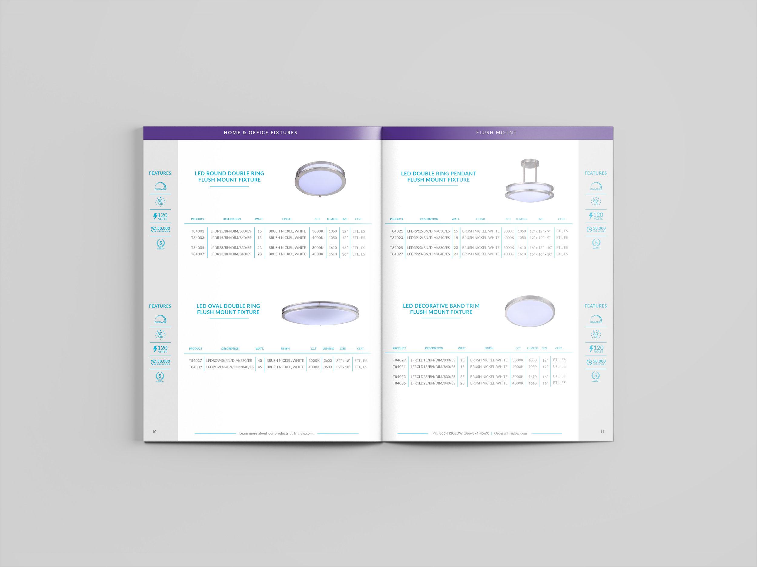
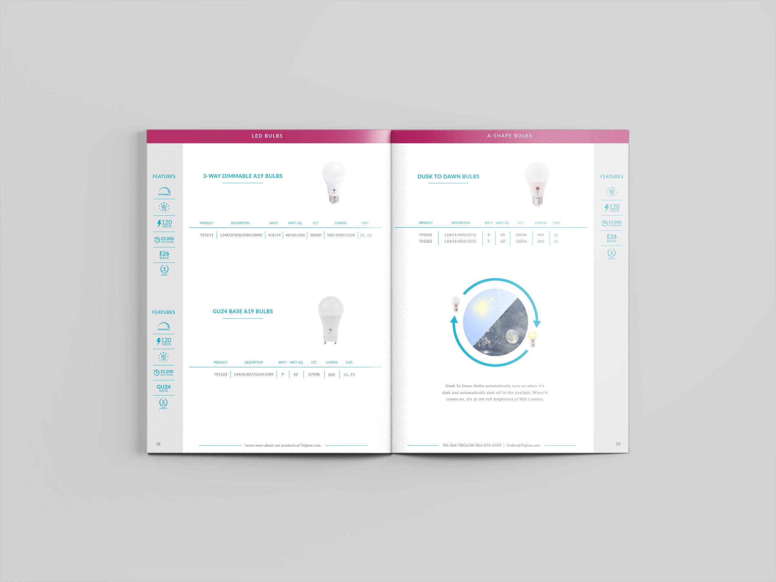
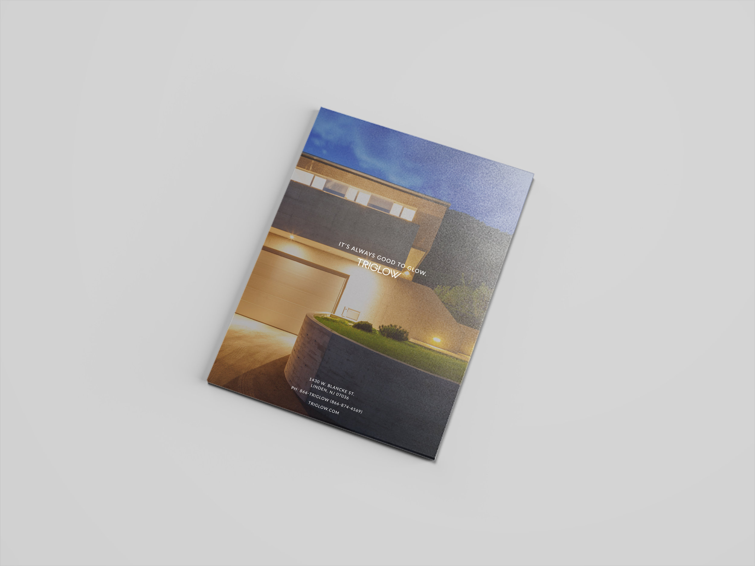
For the 2017 Triglow catalog, we wanted improve the typical, information-heavy formula of our competitors. We utilized color coding, white space, and an icon system for quickly identifying necessary product features. Each product is laid out to have its name and an image at the top, icon descriptors to the right or left (depending on which side of the spread it landed on), and a grid of detailed product information below. At the top of each page is a bar of color that represents the specific section or product type.
After formatting and finalizing content, we also decided to print it on thicker stock paper than the competition in order to present ourselves as a higher-end, quality option for bulbs and fixtures.

