Tanks & Tankards
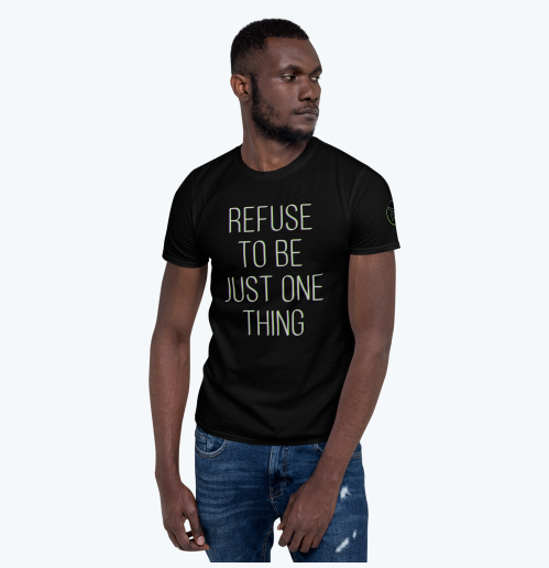
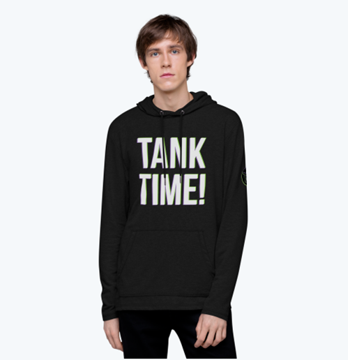
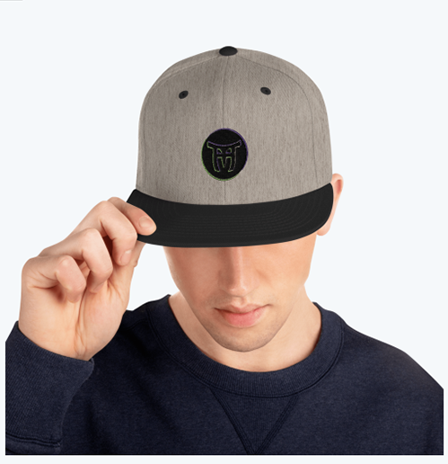
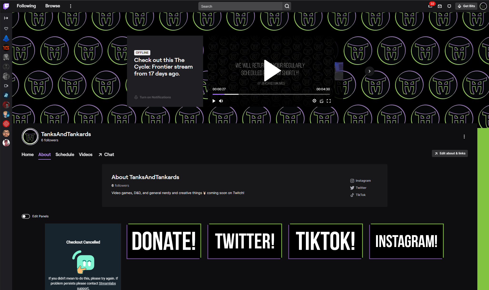
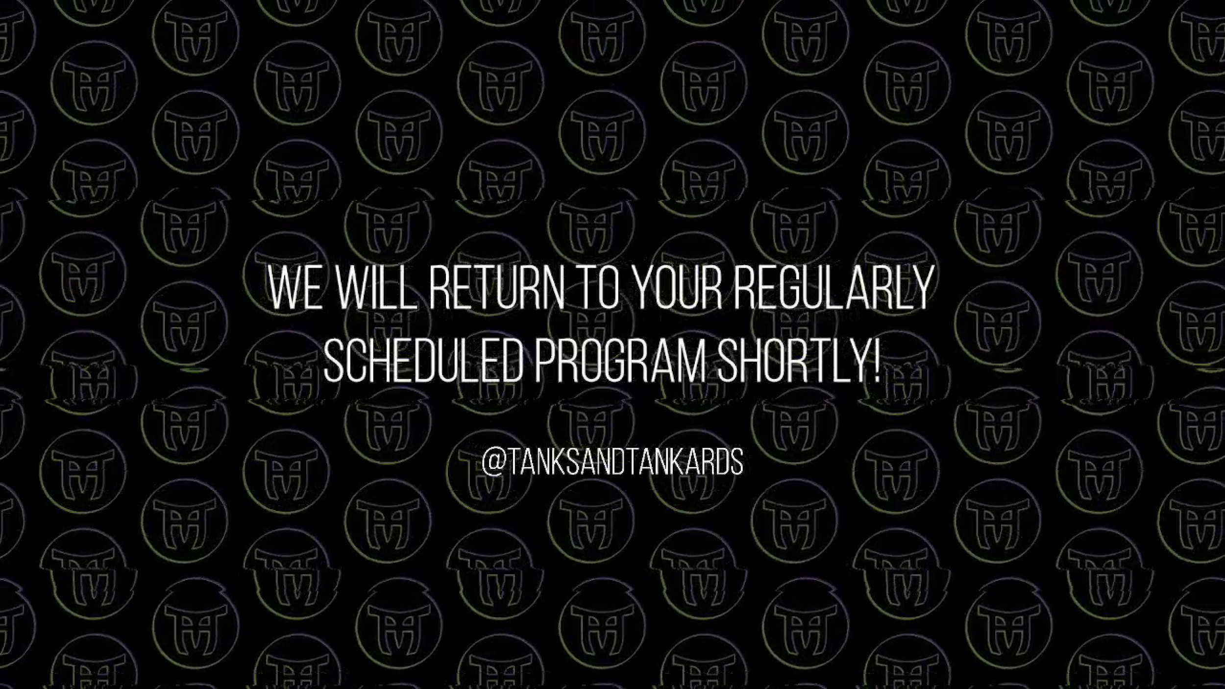
For this project, the logo is derived from the shapes found in old warrior helmets and Paifang style architecture in combination with the characters “T+T”. These elements come from specific video games that are relevant to the brand, which is focused on entertainment and gaming. The colors were chosen to contrast those older concepts by feeling electric and modern to the gaming genre. The style was then translated across merchandise, social banners, and the channel/scene designs for Twitch streaming.
Programs used for this project include Illustrator, Photoshop, and After Effects. The motion versions of these scenes can be seen on the Twitch TV channel here.
Dunna Did It
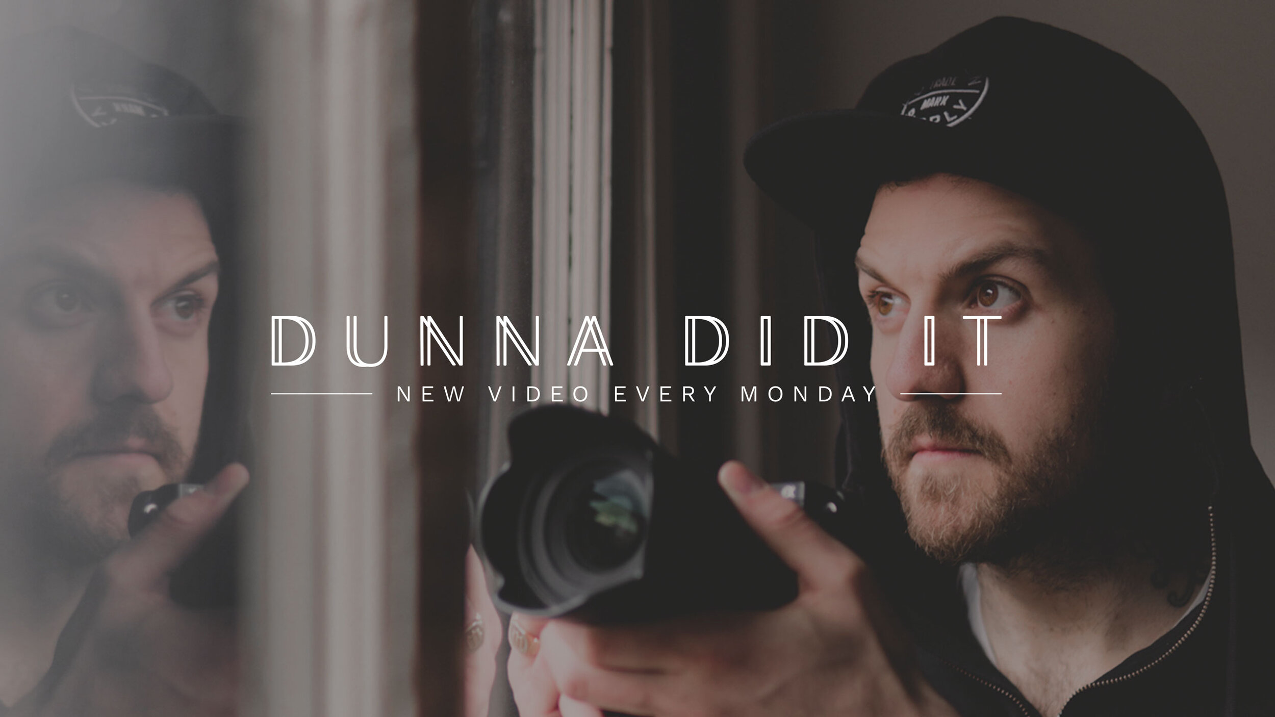
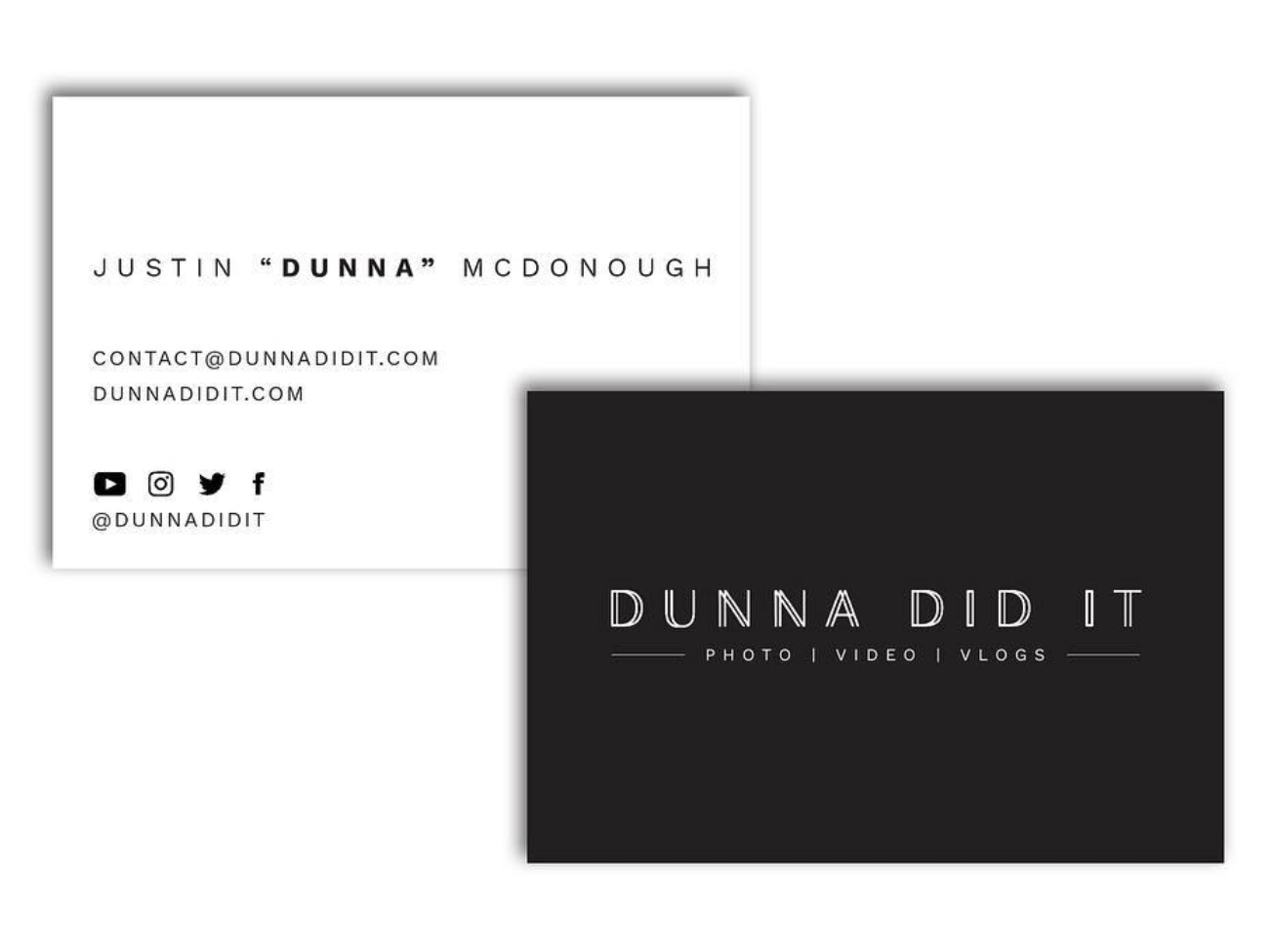
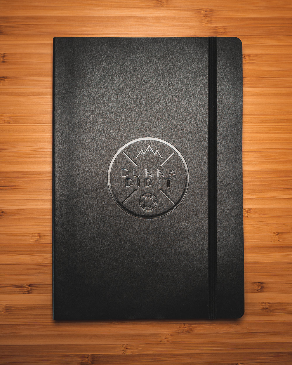
Image 1: I worked with Dunna to create a text-based logo with his YouTube channel name. I designed custom, modern typography for it. We overlayed it on a photo of his for all of the social media and website banners.
Image 2: Dunna and I wanted the business card to be very minimal and clean. The information is segmented and concise to achieve that. We also printed these on a recycled cotton card to give it some texture under the simple graphic design.
Images 3: I also designed a separate emblem for Dunna that is used for merchandise and a YouTube opening sequence. We wanted it to feel clean, utilize the typeface on all of the banners, and reflect what Dunna is about.
Poison Places Productions


The idea that the client and I went for in branding Poison Places Productions was to keep a darker, mainly neutral color scheme and find a way to use typography for the logo. We wanted the symbol to be strong enough to stand on its own from the actual brand name too. I experimented with different typefaces to create a Rose from the letter “P” and incorporated a dark red to match the energy.
Fox Athletics
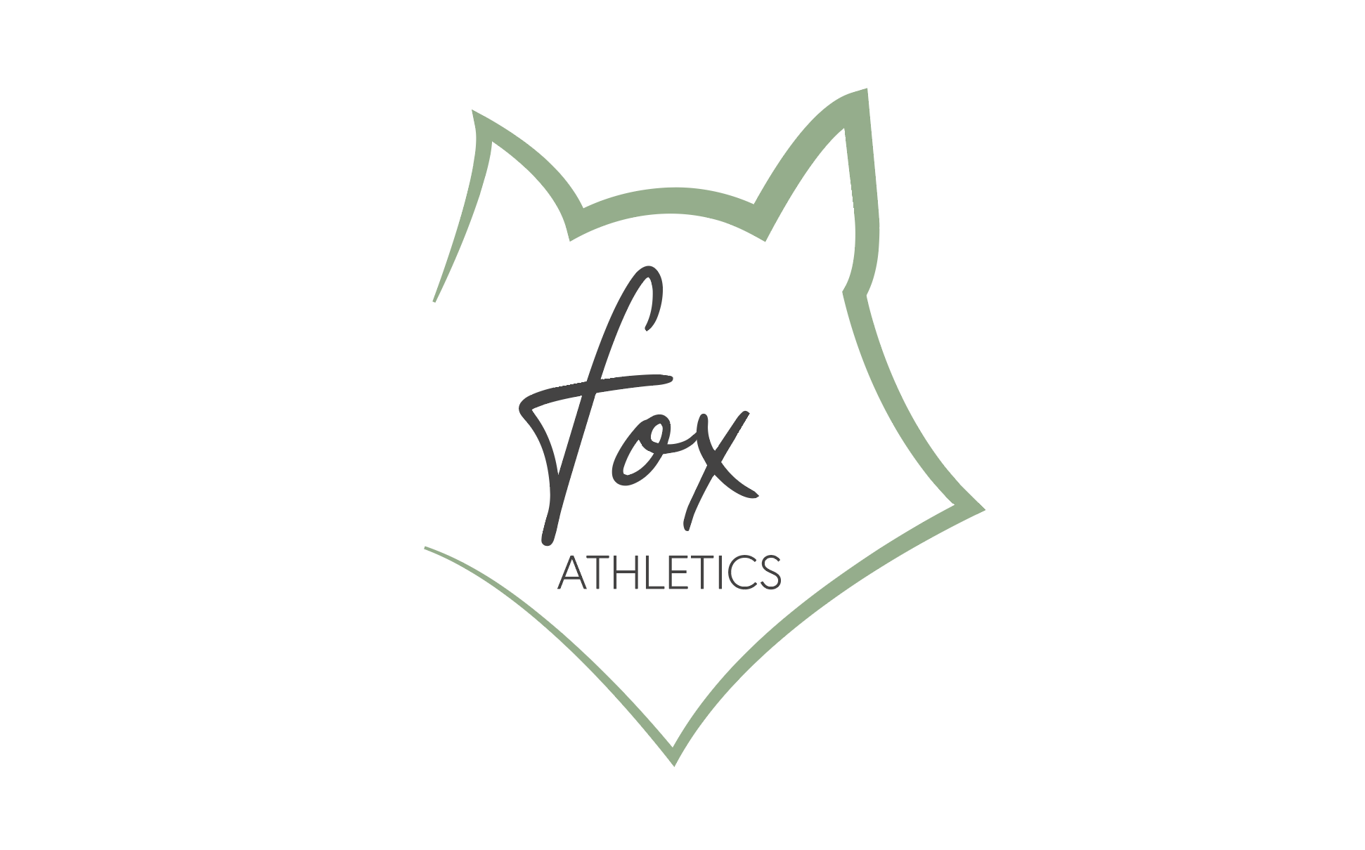
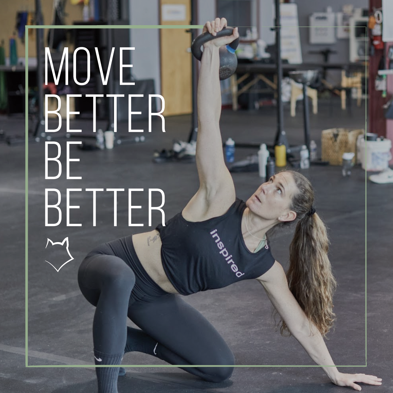
For the creation of the Fox Athletics brand, we approached it with a non-traditional touch. We wanted to bridge what it means to be masculine and feminine in the world of athletic training. The color palette, font choices, and graphic elements are all meant to reflect that by visually contrasting one another, yet still being cohesive. Translating the brand to social and print media, the emphasis is on strong lines that are still somewhat delicate, and photography that emphasizes dynamic movement of the human form. We evaluated brand voice quite heavily on this project as well, aiming for an inspiring and honest tone as opposed to the more typically aggressive or rigid ones.

