
Republic Wireless By Dish SIM Kit
Click on the images below to enlarge


Pictured above is the progression of “Republic Wireless by Dish” SIM kits that I worked on. The first two images are of the existing silhouette with new content and layout. The third image is the blueprint of what a consolidated version would look like, based on feedback we received. The fourth image is the actual design draft of that blueprint. The final three images are of a physical mockup we showed executive leadership for a better understanding of scale and construction.
We originally had a SIM kit that customers complained was physically not easy to handle/open, the instructions were overcomplicated and inconsistent with other materials, and it was costly for us to produce. I formulated this concept based on competitive research and internal intelligence, in order to make it as painless and direct as possible. Two other variables we had to factor in were our rebrand and the production timelines of making SIM kits. As a result, we wanted something that could be more evergreen than the previous iteration, and a kit that was updated visually.
This project was canceled after a business shift, but we’ve retained the research and work for future optimizations. My involvement has been: ideating and directing the creative within provided brand guidelines, working on the customer journey for activation, refining the copy of the kit and digital experience, working with our vendor to determine the cost and construction, and coordinating with executives to align on the overall strategy and execution.
Boost Support Home
Interactive prototype
When I was approached about a Boost Support redesign, I was very new to the principles of UX design. I collaborated with internal UX designers to learn our centralized visual asset system, studied Sketch, Invision, Adobe XD, and Figma, and worked to create a prototype that would act as the starting point and template for the overall structure. Above, I have a basic, interactive prototype to showcase the overall structure of the desktop experience. This particular prototype was created in XD. My role was to utilize findings from customer surveys on our other brands’ sites to enhance and simplify the layout and content and then coordinate with other UX designers and developers to figure out how it would be executed.
Dish Network Welcome Kit
Click on the image below to enlarge

While on the CXO team, redesigning and consolidating our printed welcome materials and guides, we were approached about a specific problem: our technicians who install equipment at the customer homes were forgetting to hand out required documentation as well as the welcome guide that we were spending a lot to produce and improve. My supervisor and myself partnered to understand what obstacles were arising and considerations to make within a solution. We came to these conclusions: one item instead of several would make it more efficient for the techs, an outer layer would protect informational content from being damaged in transport, and adding promotional materials without dramatic impacts to production timelines and bulk for techs would be preferable. We explored shrink-wrapping kits, outer bands to group materials, expensive boxes, and then… simple, familiar folders. A bright, brand red folder would be easy to spot and remember for a tech, contain everything and protect it, allow flexibility to add promotional materials, and be something for the customer to keep and organize the materials they need on hand. On top of that, the simplicity of it helped reduce cost of the effort.
The final welcome kit consists of the nice quality, minimal folder, a newly designed and streamlined welcome guide with helpful information about products and processes, and the important information booklet with legal and technical fine print.
This project was handed off to another team with the dissolution of my team, before I switched to my creative strategy role.
Boathouse Sports Emails
Click on the images below to enlarge

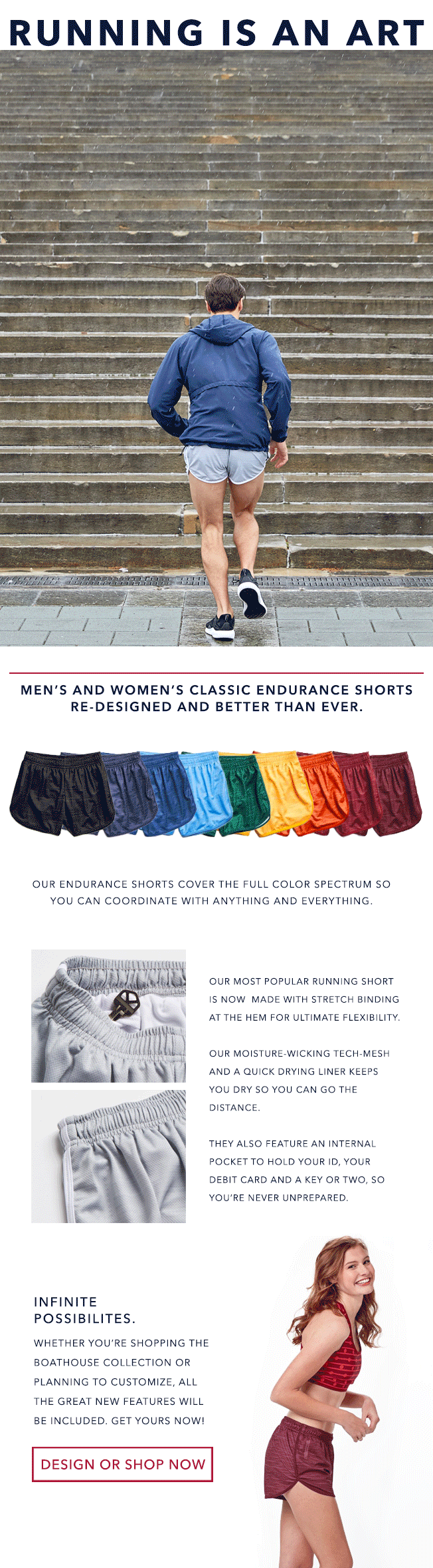


One of my main responsibilities while working at Boathouse Sports was the creation of our emails and the assets that went into them. Over the course of my time there, we experimented with the visuals and enhanced the product photos to create more visual interest. Our chief brand officer would provide me with the theme/objective, I would come up with any copy/creative, and then we would work together to coordinate photography (shoots and/or selection) and assistance with asset creation as needed.
I recently decided to redesign one of these emails to show how I would do it today compared to when I was working there years ago. You can see what my remixed version looks like here.